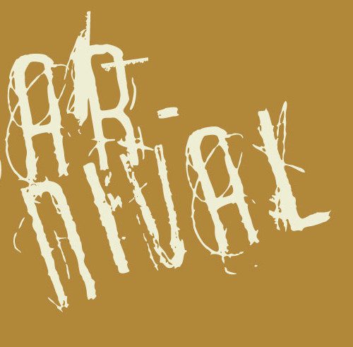
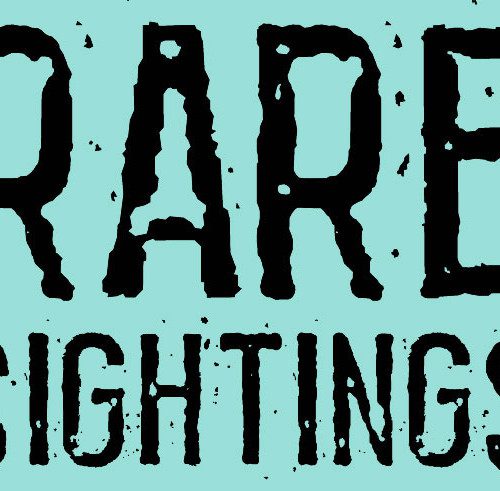
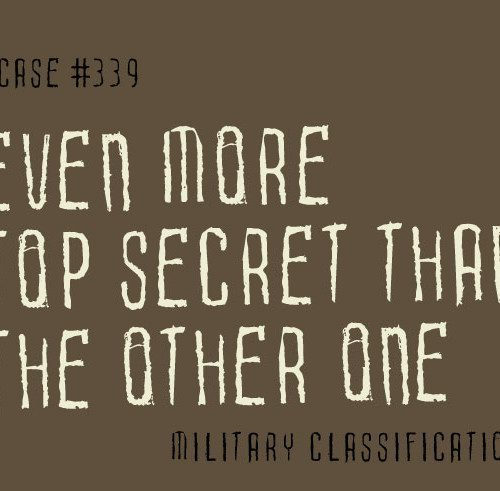
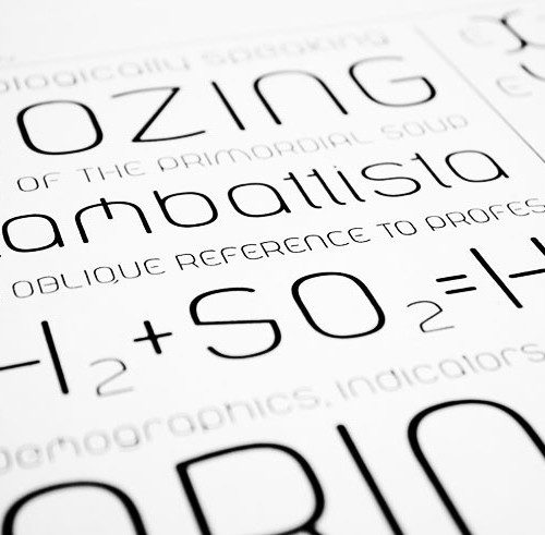
Custom Type
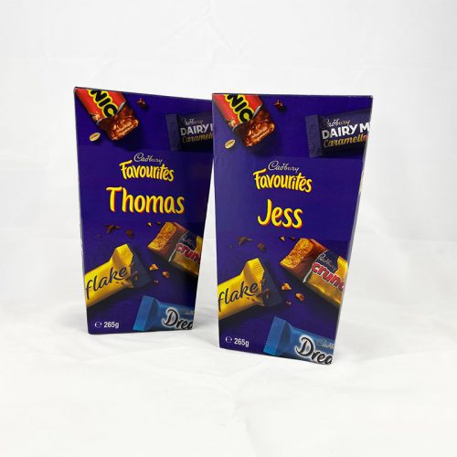


We are an international type foundry based in Newcastle, Australia. For over 20 years, Australian Type Foundry has been creating custom typography, typeface designs and fonts for brands, agencies and corporations. As Australia’s most experienced font foundry, our typography portfolio includes work for Australia’s biggest brands including ABC, Officeworks and McDonalds.
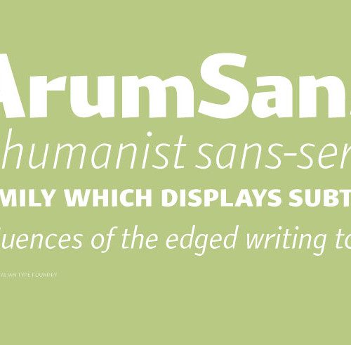
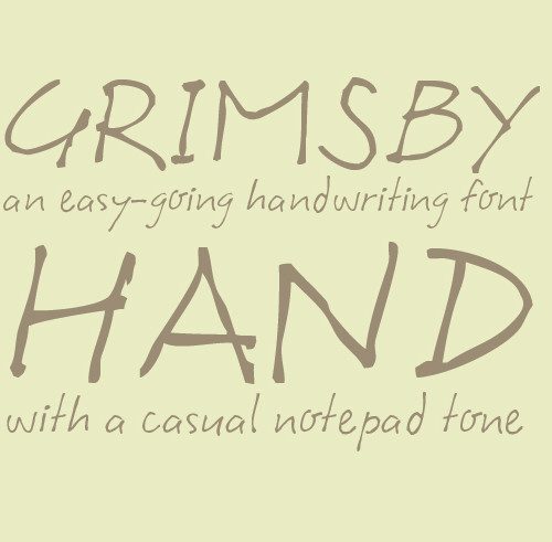
Fonts For Sale
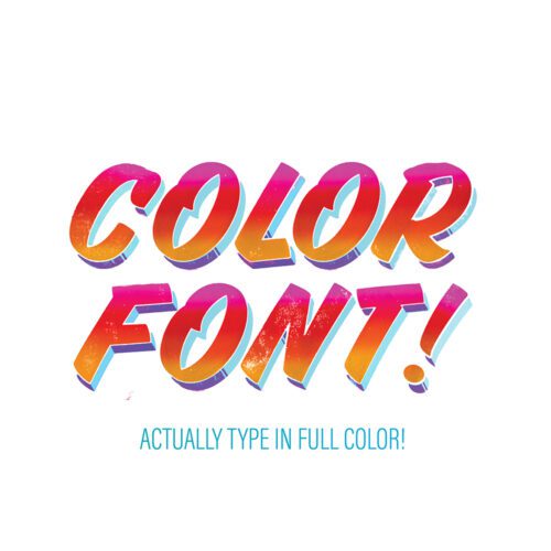
Australian Type Foundry retails a variety of original fonts for licensing and purchase. We also provide typographic consulting, modification and advice on font licensing.
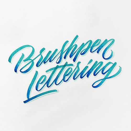
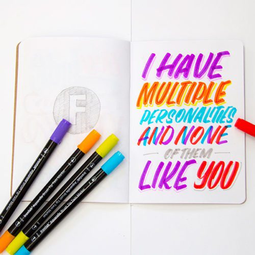
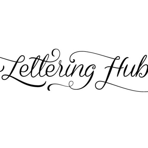
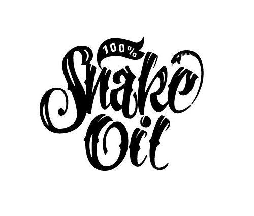
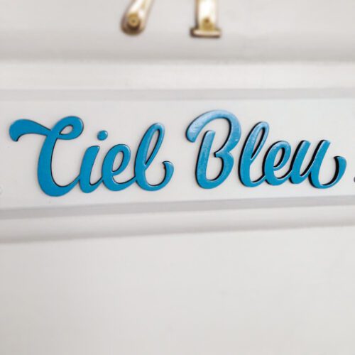
Custom Type Design
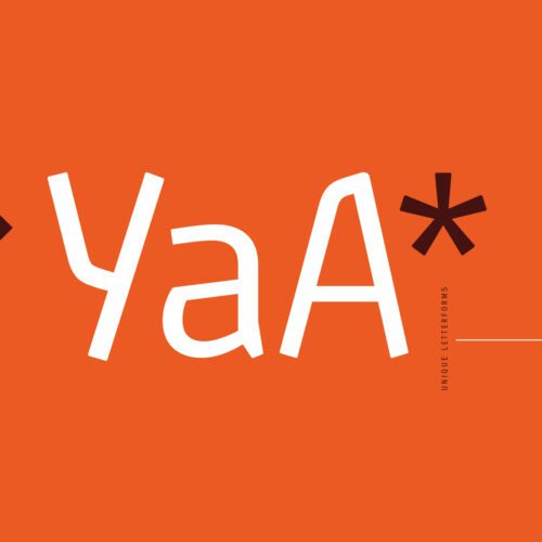
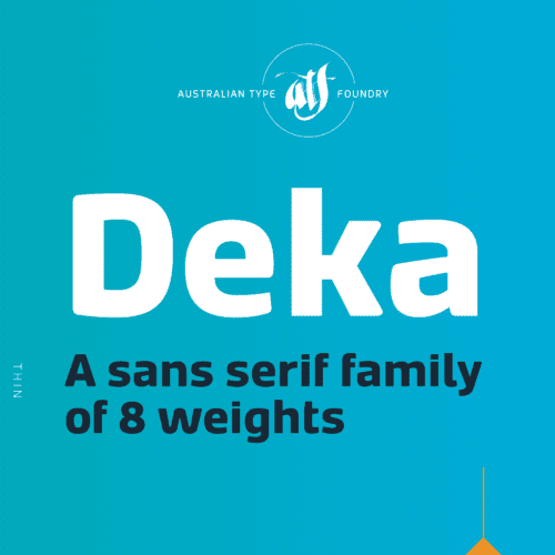
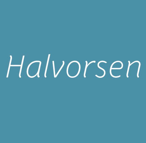
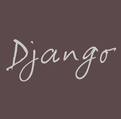
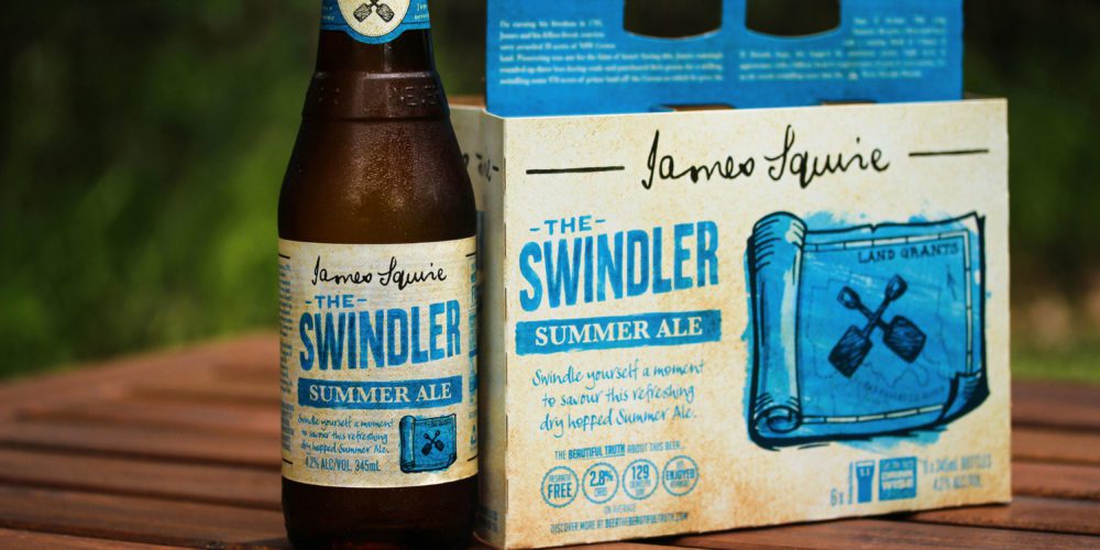
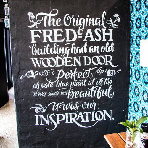
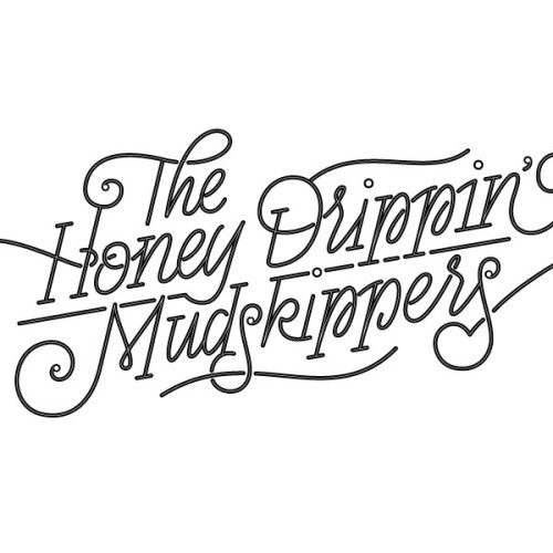
Australian Type Foundry creates bespoke fonts and custom lettering to suit the individual needs of our clients. Font designer Wayne Thompson specialises in all aspects of typefaces, typography and font design from multi-family typographic systems to individual speciality fonts.
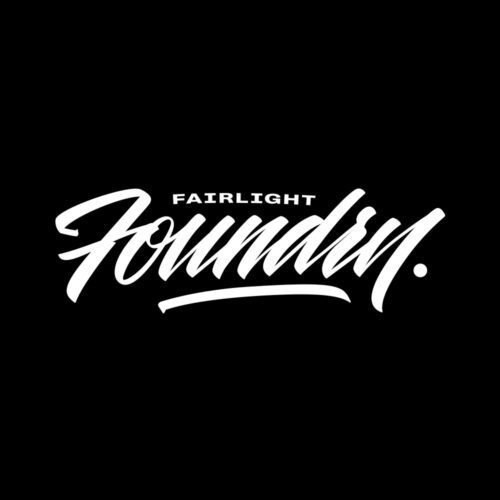
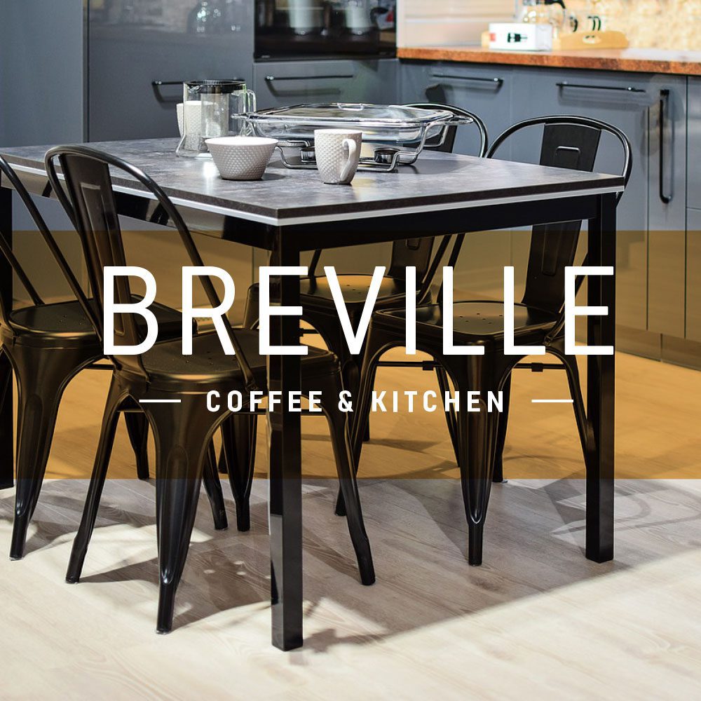
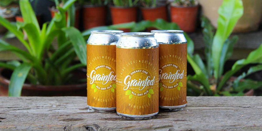
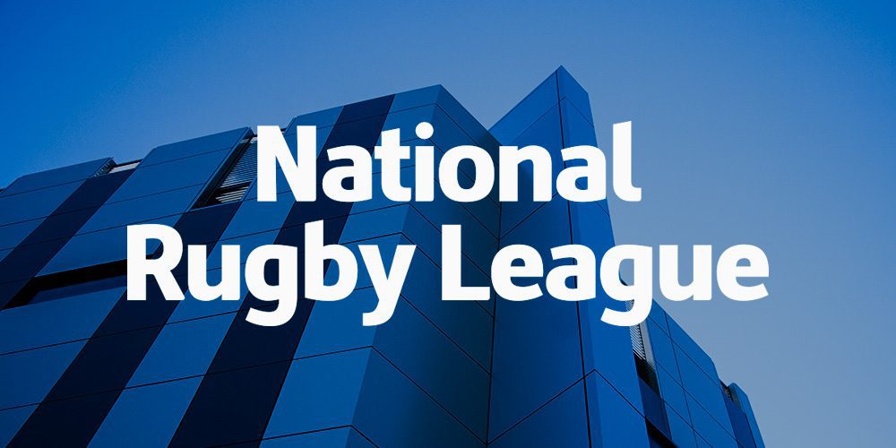
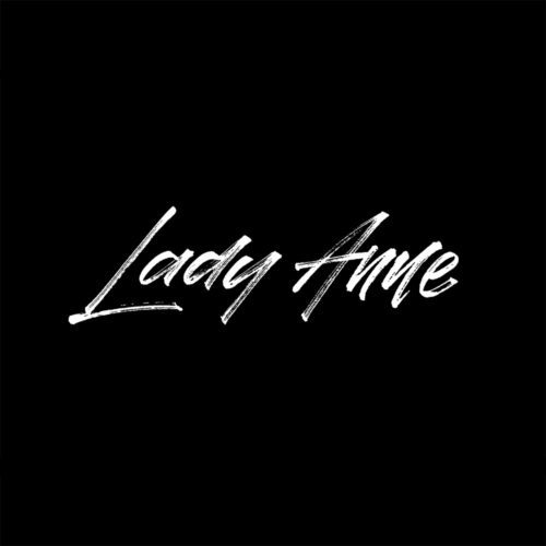
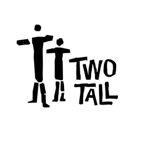
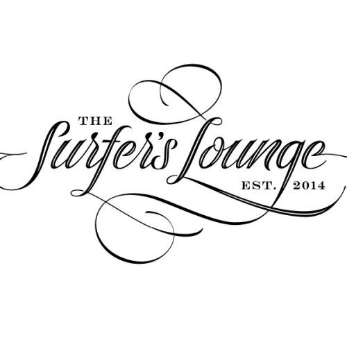
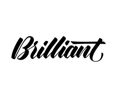
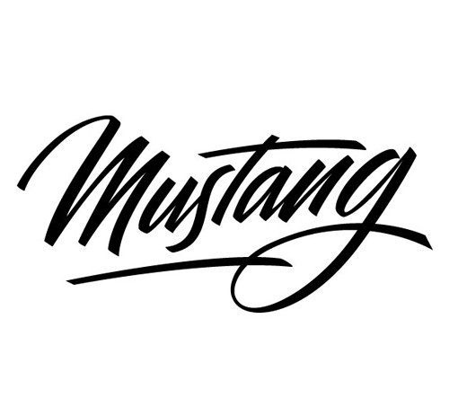
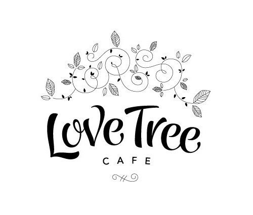
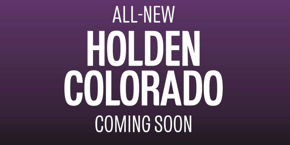
Brandmark, Wordmark & Type Logo
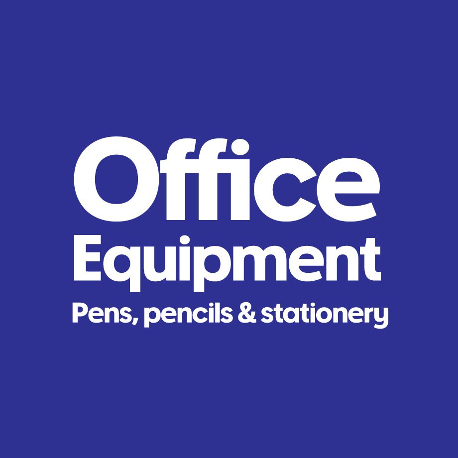
Australian Type Foundry is experienced in brandmark and wordmark design for logos and brand identities. Custom brand typography can be extended into corporate fonts and brand typefaces for clients.
Online Type Design Course
An online course in font design for anyone who wants to design typefaces or just learn to be better at typography. The classes are one-on-one with your instructor Wayne Thompson, and you learn at your own pace.
Interested in Typography Design?
Based in Newcastle, our typeface design services are available Australia wide as well as internationally. Contact us today to discuss your typography requirements.